Copyright © 2010-2017 design NAP All Rights Reserved.


株式会社はたけのみかた様の離乳食ブランド「manma」の商品ロゴ、パッケージデザイン、ツール、ネットショップなどトータルでデザインさせていただきました。
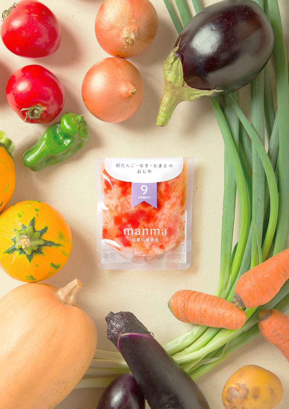
滋賀県産の本当に良いと思う自然農や有機で栽培された野菜を使用した離乳食です。
manmaのネーミングは、①お母さんのマンマ、②ご飯のマンマ、③そのまんまのマンマの意味が込められたネーミングです。
既にあるベビーフードは国産であったとしても生産者の顔がなかなか見えないので、はたけのみかたさんは顔が見える(生産者がわかる)事を大切にされています。
四季の旬の野菜をそのまま離乳食に。四季それぞれに採れる野菜がそのまま顔になるよう、透明のパウチで、シンプルに中身を訴求したパッケージにしました。
Clients requested us to make the color of vegetables visible, thus we choose a transparent packages and designed it very simply.
The other side of our design concept is “fashionable”. This concept is aimed for removing a sense of guilt for using ready-made food from mothers but giving them “What a cute!” experience.We were involved in creating the logo, graphic, package design, website, and as designer /consultant.